Naukri & Monster, I respect both – as a service and as a product.
They both must have (and continue to) contributed to careers of many people in India. Awesome products – though I always wished their search worked better. This post is not about search – but how even big and highly used products overlook simple usability and product management basics.
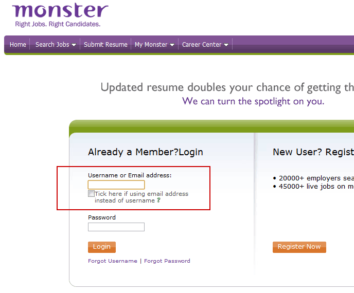
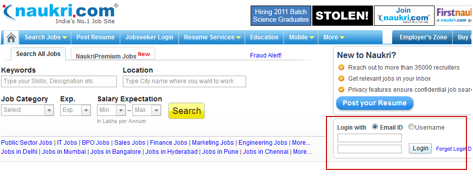
Have noticed this repeatedly and wondered – why do both (Naukri & Monster) provide option to users for selecting login credentials between username & email address? Isn’t it really simple to decipher on-the-fly if the details entered by user is/is-not a email address – a email address will always contain “@” sign or a “.com” or some domain suffix?
Other critical mistakes –
- Naukri – Homepage just missed out in labeling and pointing out the Password text-box completely. Although, it is a web standard that after Login text-box the next logical text-box is for Password; Don’t recollect seeing any other website which has taken this assumption for granted.
- Monster – Why not provide users options to login from its homepage itself rather than taking them to different page to login. It is consumer service, or is Monster not expecting frequent repeat usage.
Takeaways – Don’t over look the basics.
.
.

