Category Archives: Internet

The App World is Flat!

The App World is Flat

With Apps / Mobile growth, things are changing at a fast pace in the eCommerce / mCommerce space in India & around the world; for purpose of simplicity – calling it eCommerce without bothering about on which platform the transaction happens on.

The world is fast discovering web on smartphones, gets on-boarded to services like WhatsApp & Facebook, doing their first online transactions on Mobile Recharge services like FreeCharge & Paytm, and evolving to eCommerce, On-Demand Services & Travel. Unlike the previous predictions made in 2011/2012 – which were very company specific, this time the focus is largely around the trends in the Mobile App world.


The (App) World is Flat!

In old days of Internet Marketing, there were strategies to acquire users / customers by categories through multiple marketing channels – Adwords, SEO, Email, Display advertising, etc

The App World is flat. Be it large commerce startups like Flipkart, Snapdeal, Ola, Uber or the ones that were launched yesterday in any space, the common ground for everyone to get started today is exactly the same – getting the App Installed. This is disruptive in many ways – if someone has $1 Mn to spend on user acquisition – no matter at what stage / scale a startup is, the cost to get the app installed now remains the more or less similar for everyone.

As other core functions of eCommerce like Logistics, Merchants, Payments get more organised & commoditised; and User Acquisition starts with getting the app installed – a new ecommerce marketplace startup that launches today with $5 Mn Series A investment has much better chance to succeed than ever before or give existing large players good competition.

That puts everything in a interesting perspective – As cost is exactly the same, what are the differentiators? Its the core value proposition of the startup – the one communicated before user installs the app and one actually delivered. This change makes every startup focus a lot on building a great product and an awesome consumer experience than ever before!


Discovery, Marketing & Product Experiences:

In the ‘web’ world, Google allowed marketers to reach ‘users with intent’ through Adwords (or SEO) and so did Facebook to reach a certain demographic of users on its platform. This has changed fast. For high growth mobile startups that are scaling up in India – Google & Facebook’s share of marketing spends is shrinking when compared to others.

App Installs plays a level playing field in User Acquisition today; networks & affiliates are able to drive App Installs at better volumes with very competitive rates when compared to Google, Facebook or Twitter. Discounts, cashbacks & user driven growth form new means of acquiring users at a exponential rate. Share of wallet from marketing spends for Google & Facebook is going down.

Any consumer app like Flipkart / Snapdeal or Google / Facebook can now read multiple signals off user’s phones – apps, locations, contacts, texts messages, and so on and redefine how users are targeted for advertising. Flipkart’s plans to build online advertising business are well known; could be huge opportunity if kept independent.

Mobile App capabilities can also translate into building relevant product experiences for end users. For example – a Cleartrip trying optimise its Hotel Booking Offering for users when it reads a Flight Booking SMS from Airline website on user’s phone; Housing showing financing options for house from HDFC knowing that the user has the HDFC Bank App installed on phone; or Flipkart showcasing user products based on how quickly they can be delivered; of a Finance App recommending user investment options based on his Account Balance and so on. In one of my recent conversations this came up – today a user’s mobile phone location is his delivery address.

Till now, Ecommerce products today have just transformed from web to app, not essentially unlocked the value the mobile platform brings. If existing players don’t innovate, some new startups will. Focus on building awesome products.


App Discovery will evolve:

App Discovery and Install today act as the top of the funnel for every User Acquisition effort. Visiting a App Store to download any app is a redundant step; its not required if app is discovered through other channels. Expect Google Play to take the Install button (or trigger) outside the Google Play Store and let users install apps without explicitly visiting the Play Store in background. If that happens, expect APIs that will trigger app installs for publishers & advertisers making user acquisition & advertising dollars more efficient. Yes – that possibly kills ASO, App Discovery as we know of today on App Store, and Google’s Adwords product for Play Store.

Mobile Apps ecosystem is cursed with high uninstall rates. Users & Marketers would want to move towards the philosophy – you acquire user only once, does not matter through which channel – App Store or Browsers. Users would want the product / service on-demand on every platform – Smartphone or Desktop Browser whenever they want without hassles of user / account management. Expect browsers integrations & enhanced capabilities on Chrome with App Stores (Google Play to start with) that enables users to access the Apps installed on their smartphones on desktop or any other platforms without having to log-in separately.

App Stores like Google Play or Apple iTunes will also evolve from their current stage of ‘enabling discovery of mobile apps’ to ‘authentication of user credentials’. App Stores will retain user information – personal details, payment info (saved cards or wallet), delivery details and so on to transform into 1-click authentication platforms. Example – Users while shopping on Snapdeal, Flipkart or Amazon Mobile App can do 1-click checkout with App Store authentication that gives the Ecommerce service all user information w/t payment information data that is required for Ecommerce sites to fulfil the transaction.

This is something similar to what Facebook did earlier where Apps & Games on Facebook Platform received user information on Login-with-Facebook. Its still early days for Mobile App Stores, they will evolve in big way going forward.

Note: Google is already working in this direction to distribute Install action with App Invites (Beta)

Engagement v/s Instant Gratification:

As consumers get habituated to transactional & on-demand services – social products & social commerce products (like Wishberg – my previous startup) or any other would find it extremely difficult now to scale up or grow without providing the instant gratification experience.

Existing large companies in this space are picking up clues and started to move towards a transactional experience with Buy buttons. To ecommerce companies, working with large networks for such 1-click transaction experiences is a big win.

Expect focus of large social networks (Facebook, Twitter, Snapchat, etc) & discovery channels (Google, Pinterest, etc) to move from top of the funnel (i.e. product discovery or media spends) to bottom of the funnel (enabling transactions or margins). They are currently driving Mobile Installs or Traffic for their current advertisers, going forward may be looking at driving customers. Such products or services know more about users than anyone else.

Products like Facebook, Google will retain customer information (delivery, location & saved card details) and move towards enabling the one-touch buy experience.


Frequency is all that matters now!

This topic itself calls for a longish post (may be for some other time), for now the point to note is that Mobile App makes perfect use-case for a high frequency consumer behaviour. There are already many studies that have concluded that consumers prefer to have only few apps on their smartphones – ones that are frequently used.

Apps like WhatsApp, Facebook, Twitter, Snapchat, Instagram etc which see extremely high engagement (and frequency) are less likely to be uninstalled by user while an app that is not used for few weeks (or even days) is very likely to get uninstalled. Ecommerce products would not be able to match levels of usage demonstrated by Social Apps.

Transactional apps that have a daily / weekly use case like Cabs, Food Delivery, Grocery, etc would see better usage compared to others. As that gets discovered, expect Ecommerce apps to expand into multiple categories / segments that could be completely diverse – Paytm moving to eCommerce or Travel, Ola moving to Food Delivery and so on to drive frequent usage.

This strategy works well with two big motives – increases app usage as users have more reasons to open & engage with the app and also adds up to their topline. But for vertical commerce players like Home Repairs, Home Furnishing, Jewellery, Footwear or others – surviving in App World with infrequent usage will be extremely challenging.

Today, Success or Failure of any startup is just an uninstall away!


OnDemand Services may disrupt eCommerce forever.

In past few months, many on-demand services have raised massive Series A rounds, the ones focussing on infrequent use-cases like Home Repairs, etc will start struggling with user retention and other ones who are driving high frequency use-cases like groceries, food delivery will start bleeding because of poor unit economics.

Ecommerce today as we know it has its own challenges – relying on third party logistics, depending on unverified sellers & products, deep discounting of products to drive volumes and their attempts to move from cash on delivery to cashless transactions.

On other hand, offline retailers in India are up in arms against online players but have little competition to offer. If OnDemand services like Groffers, Swiggy and others in this on-demand space started delivering users Ecommerce products partnering with your offline retail giants and local stores – eCommerce changes in this country forever.

No more waiting for even for 24-48 hours, the product that you want, from the trusted store of your choice, in the payment mode of your choice, in your hand – in next 30 minutes. The Amazon Prime or Flipkart First experience delivered to you, every time. This changes everything we have learned or known about ‘traditional ecommerce’.

Concluding Notes

Mobile app & growth story is just getting started. Its too early to declare winners because the App World is Flat!

14 Ways to Emotionally Engage users with your Product

Most conversations with entrepreneurs and product managers who want drive engagement and bring viral features to their products are answered as ‘We will gamify our product through features’. This post is about clearing some nuisance around the topic of gamification in products.

Gamification has nothing to do with building features. In fact, even Product Management has nothing to do with building features. It is not a rocket science, product managers usually figure out the ‘building features’ part of it with time and experience.

“People don’t buy products. They buy better versions of Themselves.”

So how do you ‘connect’ users with your product? Not through features, not through gamification, but by triggering certain emotions with your users.

Gamification = Getting People Emotionally Engaged with Product.

Below are some of the most powerful emotions people have along with few examples that will help you figure out how get users to emotionally engaged with your product / startup.
PS: The number of emotions could be more, I have referred to only 14 here.

1. Expression

Expression – People love to express themselves. Enable it.

Products that allow users to express themselves:

  1. Tumblr
  2. Twitter
  3. Facebook
  4. Medium

Products that allow users to express themselves anonymously:

  1. Secret
  2. Whisper
  3. FML

Tip: ‘Expression’ is used as a core use-case in product.

2. Acknowledgment

Acknowledgment: People love getting acknowledged. With interactions & endorsements.

Help people getting acknowledged. They love it!

  1. LinkedIn – Recommendations & Endorsements are social acknowledgments which users love.
  2. Twitter – Retweets and Replies on tweets are great way to be acknowledged.
  3. Facebook – Likes & Comments are acknowledgments to status messages users shares
  4. Quora – Upvotes & Comments is acknowledgment to your answers.
  5. Tumblr – Love & Reposts are acknowledgments to you posts.

Tip: ‘Acknowledgments’ lead to ‘User Notifications’ which further lead to Engagement. Always build features that enable acknowledgments in products that use ‘expression’ as use-case in product.

3. Exclusivity

Exclusivity or Privilege: People love being privileged. Make it exclusive.

Make it exclusive. No one likes the feeling of being left out.

  1. Gmail – Gmail invites were exclusive to few users. People were ready to buy invites off Ebay.
  2. Quora – Only existing users can invite new users.
  3. Pinterest – Users need to apply for access. After few days they were granted it.
  4. Mailbox – Users were in queue to get access to the app.

Tip: ‘Exclusivity’ works best for initial referral program for driving sign-ups.

4. Being Cool

Being Cool: People want to be Cool. People want others to know they are Cool.

Make your users look cool when they share your product.

  1. Frontback – Share a snap along with a selfie. Lets users be cool.
  2. Vine – Short cool creative videos.

Tip: ‘Being Cool’ will help you drive sharing on Social Networks.

5. Nostalgia

Nostalgia: People have memories. Sweet Memories. Remind them about it.

Remind users about some of the best times they have experienced.

  1. Timehop – Complete product is built around Nostalgia. Reminds users of special moments from the past.
  2. Facebook – 2014: Year in Review videos
  3. Twitter – 8th Anniversary: Which was your first tweet.

Tip: ‘Nostalgia’ helps get back old users and revives their interest. Can be only used once in a year on special occasions.

6. Curiosity

Curiosity: People want to know. They fear on losing out. Keep them curious.

Keep users curious. Keep them looking for more.

  1. LinkedIn – The feature ‘who viewed my profile’ tries to keep its users curious, and engaged.
  2. Twitter – Catching up with Timeline, mostly is the fear of losing out.
  3. BuzzFeed / UpWorthy / ViralNova – All try to trigger curiosity of readers through their post titles.

Tip: ‘Curiosity’ in products helps you increase repeat usage.

7. Competitiveness

Competitiveness: People love to compete with others. Creates a sense of achievement. Make it happen.

Drive users to compete with friends / others.

  1. Foursquare – The leaderboards between Friends was a great way 4SQ ensured people kept checking in.
  2. Quora – The feeling of ‘I have a better answer’ or ‘I can answer this question in a better way’ keeps driving engagement.
  3. Fitbit – Leaderboard that tracks your fitness with friends.
  4. Hackrank – Programming challenges.

Tip: ‘Competitiveness’ leads to greater engagement. Though its novelty in private group is lost after some time.

8. Stay Organized

Stay Organized: People love to organize things. Organize everything. Make it happen

Give users stuff that they want to sort / organize. Keep them busy.

  1. Pinterest – Lets you organize pins / interests/ stuff you love.
  2. Evernote – Organize all your notes.
  3. Wanelo – Organize fashion stuff. Ask girls how much they love doing this.
  4. Calendar / Contacts – They are always in a mess. Its a never-ending struggle to organize this. Google Contacts & Google Calendar help you keep them in place.

Tip: ‘Staying Organized’ helps your users spend more time in your product. It soon becomes a habit.

9. Importance

Importance: People love to feel important. Its about them. Their identity. They want to show off.

Make your users feel important about themselves.

  1. LinkedIn – My professional achievements., that is how a user sees it.
  2. Twitter – My views. My opinions., that is how a user tweets.
  3. FourSquare – Checkin is telling the world – I am here.
  4. About.me – This is me. This is my identity.

Tip: ‘Importance’, everyone wants to be important. The product usually ends up being shared, talked about – and results in others wanting to do the same.

10. Authority

Authority: People love to display their authority on a topic. Give them opportunity to do that.

Help create authority for users. Users want to be acknowledged as influencers by others.

  1. Quora – Authority by Topics. Asked to Answer is being authoritative.
  2. StackExchange – For programmers.
  3. HackerOne – For hackers.
  4. Hacker News – For Geeks.

Tip: ‘Authority’ is the importance others in a community or forum assigns to select users. Users want to be acknowledged as being authoritative, it helps increasing engagement and spending time on the product.

11. Visual

Visual: People love stunning visuals. Its a powerful emotion.

Visuals create impact in product. Don’t miss on it.

  1. Instagram – Personal Emotions.
  2. Flickr – Professional Emotions (yes unfortunately for Flickr).
  3. 500px – Photography community.

Tip: ‘Visual’ is a substitute to all unsaid emotions. Use well when your product is build around pictures and photographs.

12. Freebies

Freebies: People love Freebies. Badges. Credits. It all works.

Freebies work. Make use of them correctly.

  1. Quora – Credits users get when other upvote their answers.
  2. FourSquare – Badges for Check-in.
  3. Uber – Credits to Refer Friends.
  4. Facebook / Twitter / Google – Regularly use Advertising Credits to on-board new advertisers.

Tip: ‘Freebies’ – use it only for one purpose. Can be used for activations, sharing or driving engagement. Use it for one use-case that can measured.

13. Money

Money: People want to make Money. People want to receive Money.

Money is one of the strongest emotions. Portray it positively.

  1. Google Adsense – Opportunity for bloggers, individuals, publishers to earn money online.
  2. PayPal – Receive money from anyone.
  3. Elance – Get paid for free-time work.
  4. Kickstarter – Raise money for your projects.
  5. Gumroad – Make money by selling digital goods.

Tip: ‘Money’ – Receiving Money / Making Money is a positive emotion. Giving away is negative.

14. Sex

Sex: People want Companions. People want Dates. People want Sex.

Keep it simple, keep it safe.

  1. Tinder – Helps you find date.
  2. Match.com – Helps you find date.
  3. OkCupid – Helps you find date.

Tip: ‘Sex’ – It is more about selling the Hope. Keep the product simple. Don’t over engineer.

Concluding Notes:

When you build any feature, try to trigger a emotional engagement with user. If you are in early stage of your product development or in process of making your product roadmap, spent some time with this methodology – 15 Steps Towards Building a Great Product.

When it comes to including emotions in your product, ensure the following:

  1. Use max 2-3 emotions per product.
  2. Gamification is not about building features. It is about emotionally engaging a user.
  3. Don’t exploit users. Be subtle. Be good.

Good Product Manager v/s Bad Product Manager

I recently read – ‘The Hard Thing About Hard Things‘ by Ben Horowitz. This book is a practical guide for Founders & CEOs about running a business, handling tough situations, a must read! 

Ben Horowitz is currently the co-founder and general partner of Andreessen Horowitz, a Silicon Valley-based venture capital firm. Previously he was co-founder and CEO of Opsware which was acquired by HP for $1.6 billion in 2007. At Netscape, Ben was Director of Product Management where he share this note with his team.

The note is from Ben’s book where he writes about difference between a Good Product Manager and Bad Product Manager. I believe this is a amazing guide on what Product Managers should focus on. 

————————————————————————————————————————

Good product managers know the market, the product, the product line and the competition extremely well and operate from a strong basis of knowledge and confidence. A good product manager is the CEO of the product. Good product managers take full responsibility and measure themselves in terms of the success of the product.

They are responsible for right product/right time and all that entails. A good product manager knows the context going in (the company, our revenue funding, competition, etc.), and they take responsibility for devising and executing a winning plan (no excuses).

Bad product managers have lots of excuses. Not enough funding, the engineering manager is an idiot, Microsoft has 10 times as many engineers working on it, I’m overworked, I don’t get enough direction. Our CEO doesn’t make these kinds of excuses and neither should the CEO of a product.

Good product managers don’t get all of their time sucked up by the various organizations that must work together to deliver right product right time. They don’t take all the product team minutes, they don’t project manage the various functions; they are not gophers for engineering. They are not part of the product team; they manage the product team. Engineering teams don’t consider Good Product Managers a “marketing resource.” Good product managers are the marketing counterparts of the engineering manager.

Good product managers crisply define the target, the “what” (as opposed to the “how”) and manage the delivery of the “what.” Bad product managers feel best about themselves when they figure out “how”. Good product managers communicate crisply to engineering in writing as well as verbally. Good product managers don’t give direction informally. Good product managers gather information informally.

Good product managers create collateral, FAQs, presentations, and white papers that can be leveraged. Bad product managers complain that they spend all day answering questions for the sales force and are swamped. Good product managers anticipate the serious product flaws and build real solutions. Bad product managers put out fires all day.

Good product managers take written positions on important issues (competitive silver bullets, tough architectural choices, tough product decisions, markets to attack or yield). Bad product managers voice their opinion verbally and lament that the “powers that be” won’t let it happen. Once bad product managers fail, they point out that they predicted they would fail.

Good product managers focus the team on revenue and customers. Bad product managers focus team on how many features Microsoft is building. Good product managers define good products that can be executed with a strong effort. Bad product managers define good products that can’t be executed or let engineering build whatever they want (i.e. solve the hardest problem).

Good product managers think in terms of delivering superior value to the market place during inbound planning and achieving market share and revenue goals during outbound. Bad product managers get very confused about the differences amongst
delivering value, matching competitive features, pricing, and ubiquity. Good product managers decompose problems. Bad product managers combine all problems into one.

Good product managers think about the story they want written by the press. Bad product managers think about covering every feature and being really technically accurate with the press. Good product managers ask the press questions. Bad product managers answer any press question. Good product managers assume press and analyst people are really smart. Bad product managers assume that press and analysts are dumb because they don’t understand the difference between “push” and “simulated push.”

Good product managers err on the side of clarity vs. explaining the obvious. Bad product managers never explain the obvious. Good product managers define their job and their success. Bad product managers constantly want to be told what to do.

Good product managers send their status reports in on time every week, because they are disciplined. Bad product managers forget to send in their status reports on time, because they don’t value discipline.

————————————————————————————————————–

This article is posted on this blog with permission. You can download the original PDF file shared by Ben Horowitz.

“The Hard Things About Hard Things” by Ben Horowitz is a must read book for Founders & CEOs. Buy it from Amazon.com (Worldwide) or Flipkart (India).

Building The Next Disruptive Startup

The most disruptive word in Startup Ecosystem is ‘disruption’. Its used / abused / misused by almost everyone – entrepreneurs, investors, advisors, mentors, press and so on.

Founders love to call their product / startup as disruptive and so do investors who keep saying they are looking for disruptive ideas, both have very limited explanation of what disruptive startup actually means for them or they run out of examples or ideas when you ask them what exactly is disruptive about it. Most of the answers are – ‘If this becomes big, it could disrupt the market’.

Disruption

This is a random post, not intended to draw any conclusion or summary but sharing few things I have learned about disruptive startups and ideas. Probably also on how to get ideas to build your next big ‘disruptive’ start-up.

Circa 2008

Early 2008, I moved in my new role at Rediff as Product Head for Ecommerce. This was still the time when Ecommerce was extremely small in India, concentrated with some players – Rediff, Indiatimes, Ebay and couple of others; and the other side of Ecommerce was Travel which was growing steadily. At Rediff, we had 3 ecommerce products – Rediff Shopping, Rediff Books and Rediff Auctions (We shut down auctions soon after).

These were the early days of Ecommerce and to say we were not innovating then would be wrong. To bring up more users to Ecommerce, COD (Cash On Delivery) was introduced. To expand reach beyond (limited) online audience, experiments like Reader’s Offers (in Newspapers) were attempted by many. We introduced real-time customer support calls to users who dropped out during checkouts and assisted conversions via IVRs. Debit Cards were integrated. Top 20% products in top 20 cities were delivered in less than 3 days. Back then, all major players were marketplaces – that involved a lot of co-ordination with vendors / sellers for inventory, logistics, deals, order status and operations.

Few days into my new role a colleague mentioned to me about a new service – Flipkart. It was selling books. I loved what I had seen on Flipkart. The product was good if not best, but for a site that was launched just few months back – it did all that it was supposed to do perfectly with attention to detail. Prices were comparable if not the best; what blew my mind was the shipping times – awesome 4-6 days of delivery time.

In 2008, books sold on any ecommerce service took 6-10 days to dispatch (most of them had common vendors) and books that required procurement from US took 25 days on a minimum side (and customers used to wait!). Flipkart was quickly dismissed as a niche website, and books contributed to a smaller percentage of overall business. In fact there was a time that competition was more worried about Futurebazaar for its blistering marketing budget (oh, btw its in dead-pool now).

By end of 2009 I moved out of Rediff. And over time I started ordering books (and then other products) much frequently on Flipkart and was never disappointed by its service. I knew friends and colleagues were admiring loving it too. Flipkart kept growing and so did the word of mouth for them. Flipkart was rejected not just by many Investors, but also by its competitors. Over a period of time, all its competitors lost out on Flipkart as it emerged to be the face of Ecommerce in India.

So what did Flipkart do differently to disrupt Ecommerce? Instead of marketplace approach, it started off as a self-managed service. It picked up Books – the most under-served category then (under-served, but large – in 2008 Rediff Books had 1.2 Million Titles listed). It used most simplest channel for $0 marketing – Search Engine Optimization. Adding a million books to Google Index (this is in 2008) in a category that had less than 10 players helped them rank up well. And they rarely did goof up on delivery, dispatch or customer experience.

That was Flipkart. And the story about ‘disrupting a industry’ by a startup or underdog remains similar across the world. Startups / Entrepreneurs don’t disrupt a industry or vertical by ‘launching just another product’ in existing market. There needs to be a remarkably different approach, addressing a large market which is loved (or appreciated) by its initial users / customers.

So how do you get ideas for a disruptive startup?

Another example in Indian context is Housing.com – picked up real estate as a vertical that had more or less no differentiation and existing players were hardly innovating on product and consumer experience over years. Everyone was a copy-paste product of everyone else. Housing launched with a better product from day one for discovering real estate properties, focused on verified data, authentic photos and awesome user experience. While its competitors were serving advertisers, Housing started serving users. It is still in its initial days, but I am hoping Housing.com will become big someday (PS: its product is now bit more complex that it was in the initial days).

Coming back, a existing market / vertical, a large category, that has not changed for a long time are prefect for disrupting with a product that brings a fresh approach to it. While existing players keep thinking that their ‘yet another feature’ will kill this new startup that is making a dent, unfortunately this never happens. ‘Yet another product’ in a large market does not really disrupt a industry.

This probably is true for almost every big startup or product that is out there today.

  • AWS for Hosting:
    Huge market, frustrating times to set up & costly infrastructure, disrupted by on-demand computing and pay-as-you go.
  • Gmail for Email:
    Huge market, competition offering 4-10 MB inboxes, disrupted by 1 GB mailbox and of-course better product.
  • Square for Offline Payments:
    Huge offline payments market, under-served, simple product to accept payments with a phone.
  • Dropbox for Syncing Files:
    Huge need; users mailed files to save on multiple PCs or used USB drives. Simple & fast web storage.
  • Stripe for Online Payments:
    Huge need; developers where busy doing complex PG integrations. Simple to use payment APIs.
  • Uber for Transport:
    Huge market, demand > supply; Under-served market. Cool product that made the customer look smart.
  • … and so many more I can think of…

So where do you go looking for big markets to disrupt and build large businesses?


1. Look for market segments that have not changed for years.

In India context, Flipkart and Housing mentioned above fit in this example. We are (probably) done with phase of getting most of the products / services from offline world to online. Some of the verticals are still broken despite being online for so many years.

Examples that come to my mind are – Travel (Vacations – it is still an broken and under-served market), Matrimony (Nothing has changed in this vertical for more than 10 yrs, however people and culture has changed a lot), Classifieds (Largely served by few players and the model hasn’t evolved much) and so on.

Some markets are so big that there is room for multiple big players – Fashion being one of them. Some of the verticals just came online (Online Grocery & Vegetables) but are struggling to grow, maybe they need to approach differently.

One of my favorite examples here is Stripe and how it differentiated itself from others in Payment Gateway vertical. Or even Quora that came up in QnA space that had sleeping products like Yahoo! Answers or Answers.com


2. Look for large products that are ageing fast.

Look for large products that are ageing fast and its early users are complaining or it fails to provide value to them.

Some of the examples, LinkedIn (The product has not changed much over years, its early adopters are not using it as they did earlier or now they have other ways to connect with them) or Facebook (Its evident that the engagement levels are dropping and instant messaging has taken over Social Networking). Twitter (Yes, Twitter is ageing. For new users its complex to use, to understand).

More directions – Facebook was default private product; then came Twitter that was default public product. There is lot of opportunity for both products to reverse privacy. For example, Twitter is a public identity to many people, its private aspect ie. direct messaging is massively broken. Forget private product, even Twitter as a public conversation platform is also broken or difficult to explain to new users. Twitter itself is experimenting with removing @ replies to appeal to new users (while existing users will miss the feature most).


3. Look for large products that serve multiple purposes.

Look for large products that serve multiple purposes. Perfect one of their use-cases.

Best example here is Facebook. Large products like Facebook serve(d) multiple purpose – Status Updates, Messaging, Photos, Staying in touch with friends, etc. WhatsApp took up Instant Messaging, Instagram took up photos, perfected the use case and in turn made a big dent with their products. Since usage on a large product already validates the market need, build something that makes it work for users.

One of my favorite examples here is Vine how it figured out a niche for itself in the online videos vertical owned by YouTube. Though Vine was not the first to start off (there was Viddy and Social Cam who focused too much on spamy growth hacking techniques on Facebook), it was Twitter’s push that built this one up.

Also recently Zuck announced ‘Un-Bundling of Facebook‘ which serves similar use-case.


4. Look for missing components in daily used products that are ignored

Look for broken / boring experiences in the products around you that are in daily use. Broken, because you can fix them. Boring, because you can make them cool (or add value).

This probably over laps the above mentioned use-cases. Mobile OS features like Camera got replaced by Instagram, Text Messaging got replaced by WhatsApp, Mobile Phone Book got replaced by Gmail Contacts. There is a big opportunity if you can identify and replace basic utilities around you with products.

PS: The biggest broken experience on phone or devices today is battery / charging. And this is a tough one!


5. Look for big news or market changes around you

If you are too much into technology news look for changes around you and a need for product that you could build because of market changes and opportunities that come up.

Skype was acquired by Microsoft in 2011. Ever since (and even before that) there have been tons of connectivity issues with Skype. Its time for a reliable Skype, one that works as it should. Big opportunity! There is Google Hangouts, but it still doesn’t make a cut and unfortunately Google still treats this product as a part of Google+ and/or Google Talk. It requires attention as a independent product like Chrome, YouTube or Android.

Another big blow was when Google decided to make Gmail for Business a paid service for all. There are other paid business service providers, I tried a few myself when I recently was looking out for a free / alternate solution, finally giving up and settled for a paid Gmail account. Its a great opportunity to build a awesome product here.

My favorite example here is AngelList, Naval is an angel investor in 100+ startups – sensed the opportunity of creating a platform that connects startups to angels much before anyone else did. Another one is how Admob discovered mobile advertising when the world started making mobile websites (WAP sites then).

——————

Concluding Notes:

How to find Disruptive Ideas for Startup?

Listing down the 5 methods mentioned above:
1. Look for market segments that have not changed for years.
2. Look for large products that are ageing fast.
3. Look for large products that serve multiple purposes.
4. Look for missing components in daily use that are ignored.
5. Look for big news or market changes around you.

Wait, your existing startup does not fit in the above criteria? Nothing to get disheartened with, this is just a reference point. In fact I also realized that my own startup does not fit in this 🙂

Some takeaways,

  • The above 5 pointers all lead to a large addressable market. So next time a investor tells you he/she is looking for a large market, you fit in.
  • Just another startup or just another feature in large market does not make a cut. It should be a differentiated solution / product.
  • Disruptive ideas are plenty, it is the execution and team behind that matters most.
  • Most importantly, don’t build a product or startup in a market that is considered hot. Instead build something that you understand (or understand it well before you start).

And Flipkart, you have my respect for life!

PS: All notes referring to Rediff are expressed as my personal opinion. Most details mentioned here are in public domain already.

Ecommerce Product Management – Getting the Product Page Right

Just few days back I exchanged some notes with Founder & CEO of a Ecommerce company on why I never shop online with them. This venture is among the best known Ecommerce brands in India, but its product experience never gave enough confidence to transact with them.This post is result of that interaction. All screenshots included in this post are not meant to single out any particular ecommerce website and this is meant to be a general post on best practices.

This post is also an extension to my previous post on the topic – Product Management and Ecommerce that was written about two years back. While that post was about general product management principles for Ecommerce, this one is a series of posts that are specific towards reducing cart abandonment and improving conversion rates in transaction businesses. Limiting the scope of this post only to Product Page -> Checkout, this post is first in this series and talks about building the right Product Page and best practices to be observed.

Getting the Right Product Page for Ecommerce – Best Practices

When users land up on product pages through some effort (search, discovery, social, email, adwords, etc), the intent of a users here is positively inclined towards ‘knowing more about the product’ or ‘making a transaction’ and not towards abandoning the page.

The positive reinforcements on a product page are –

  • Product (the product itself), Photos, Price
  • Shipping Information (and Payment Details)
  • Additional Information – If the product, photos & price do not help make a purchase decision, then the additional information that can assist in decision making process.
  • Alternatives & Suggestions

Building Product Pages is a science & art put together with lots of common sense. They should be built / designed as decision enablers and not with the focus that allows users to look at other options in an event the user is not interested in these products.

a. Focus on One Action – ‘Add to Cart’

Yes this is the obvious point. Why is it here, everyone knows this right?

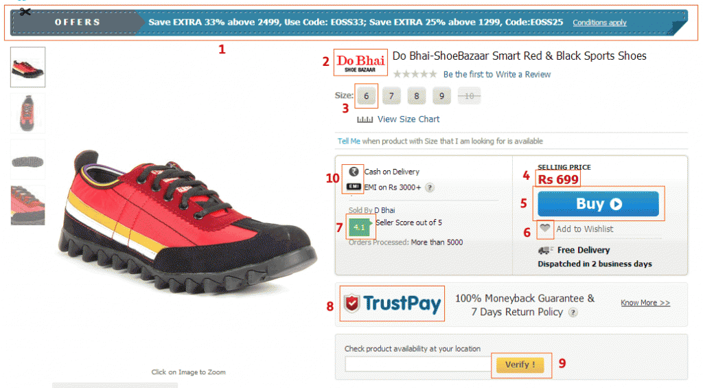
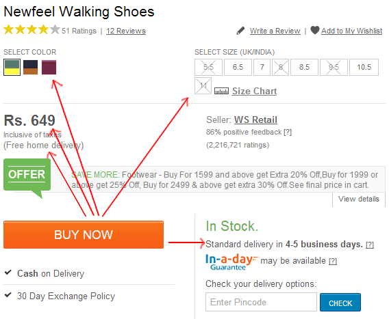
It is here because everyone knows this and because they also know everything else other than this. Simply look at the product pages of the Ecommerce websites, the number of colors on the design elements of page, multiple call to actions – take away the focus from ‘Add to Cart’ button.

As a standard practice, don’t let more than 3-4 colors creep-in on to the product page. Having a color palette helps here and intelligent use of shades of gray to highlight important information if required. Also most critical aspect is knowing that all information cannot be considered as important.

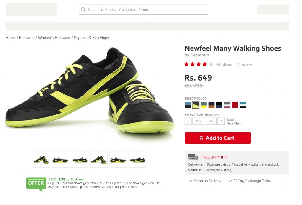
Showcased below are screenshots from top ecommerce websites in India. Notice the excessive focus on highlighting every piece on information, use of ‘design’ and colors in every product element. Have specifically chosen products that have variables like Size, Color – since those are the most complex ones to get right.

Multiple Components asking for Attention, One of top Ecommerce Sites in India

Multiple Components asking for Attention, One of top Ecommerce Sites in India

Multiple Components asking for Attention, One of top Ecommerce Sites in India

Multiple Components asking for Attention, One of top Ecommerce Sites in India

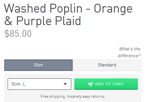
Know how to make ‘Add to Cart’ stand out – look at a product page from NastyGal.com

NastyGal Product Page - Notice the focus on 'Add to Cart'

NastyGal Product Page – Notice the focus on ‘Add to Cart’


b. Getting all Decision Enablers next to ‘Add to Cart’ Button

The most important decision enablers (either features or information) should be as closed to the ‘Add to Cart’ button as possible, not miles away. The information should be presented in a top-down readable format – specially for categories and verticals like Clothes, Shoes and others where to process the order you need Size, Style, Color and other such information.

Factors making up the Purchase Decision

Factors making up the Purchase Decision

It is first essential to figure out what are the most crucial 2-3 factors / information that a user needs to know and also accepting that not all information is must.

Add to Cart on Bonobos

Add to Cart on Bonobos

Add to Cart on Zappos

Add to Cart on Zappos

c. Use Standardized Communication & Symbols

One of the key things to focus on your product page (or anywhere on the product) is user communication. From simple things like should it be ‘Add to Cart’ or ‘Buy Now’ or ‘Add to Bag’ to another simpler things – its a tough job.

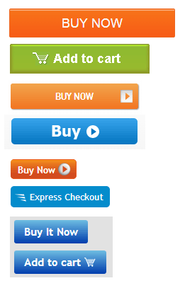
Standardization? Its a mess out there.

Standardization? Its a mess out there.

Choose widely used terms for communication. I would always suggest using ‘Add to Cart’ because 90% of other websites use it. Remember user is moving on multiple websites, and he has got familiarized with the term. Do not re-invent things for the user. Even for symbols, Shopping Cart has a universal symbol across millions of website.

Same for terms like Cash on Delivery. Free Shipping.

Another issue with Ecommerce websites is the excessive focus on branding everything. It starts from ABC TrustPay, XYZ Assurance, LMN 100% Purchase Protection or PQRS Guarantee, etc to putting up details for Sellers (Marketplaces) – ratings, stars, % feedback, etc. While all that is great, why does a customer need to know this? If its for assurance – there is no need to copy paste such fancy terms across the website.

Thinking from a consumer point of view, if there is any goof-up on any transaction – user will hold the website liable for its service, whether or not it is a marketplace or a store. A simple message like one from ASOS – “Free Returns. Not quite right? Send it back for Free” or from Jabong – “30 Days Free Return / Exchange” does the trick.

One of the leading ecommerce venture says uses the term ‘Free Home Delivery’ which I relate more with restaurant food deliveries and less with ecommerce.

PS: For some reasons, Indian Ecommerce websites love coming up with their own Glossary of Terms!

d. Handling Exceptions on Product Pages

Some of the best user experience practices are seen on products that handle exceptions really well. Only following a simple principle – “Do not show user information that is not applicable’ goes a long way in removing information overload and simplifying user’s buyer experience.

Here are the few common ones that should be displayed only when applicable –

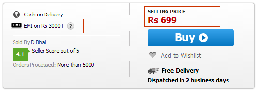
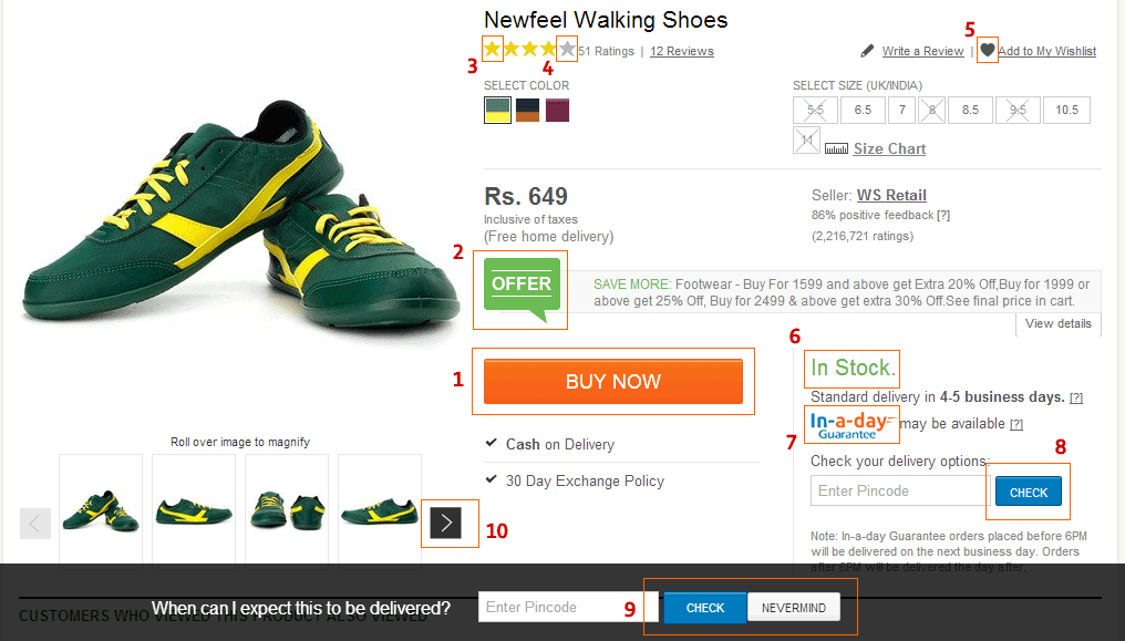
  1. EMI on Rs. 3000 – shown for all the products even those priced below that limit.
  2. Showing Cash on Delivery for products on which it is not applicable
  3. ‘Free Shipping’ when not applicable or Showing ‘Free Shipping on products above Rs. 500’ when the product is already above that amount.
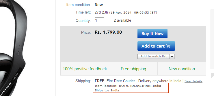
  4. Ships from Chennai – Shown to user who is from Delhi. (Unnecessary second thoughts for the user – what matters is that product is shipped in time, not from where it is)
  5. In Stock. Of-course, why else would you display ‘Add to Cart’ button.
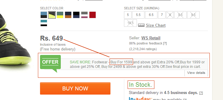
  6. Offers. Most offers kill Ecommerce profits (and the service too) – but since it is a trend now to show them, display only offers applicable to the product. Avoid blanket offers for a category.
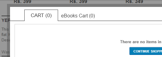
  7. Twin Carts
  8. Asking ‘Are these reviews helpful?’ when there are no reviews.
  9. Private Listing of products shown to all.
  10. Free Returns or Exchange displayed on products that are not applicable like Lingerie, Cosmetics, etc
Showing EMI when not applicable

Showing EMI when not applicable

Dual Carts – Not applicable to > 95% users

Private Listing? Why show it to users then.

Private Listing? Why show it to users then.

Feedback on Reviews not written yet.

Feedback on Reviews not written yet.

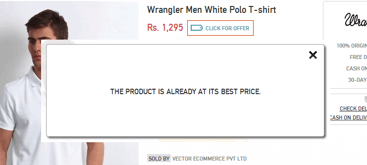
Showing Offers when none available

Showing Offers when none available

Product  In Stock. Offer that is super-stretch for the user.

Product In Stock. Offer that is super-stretch for the user.

Ships From? Why a User needs to know as long as it reaches him on time.

Ships From? Why a User needs to know as long as it reaches him on time.

Handling Exceptions are really important for every product that is being sold on a Ecommerce site. Simply because every product is different, so are its attributes and not all of them apply all the time.


e. Staying away from Fancy Features

Get rid of fancy features on the product pages, some of them really make no sense.

Some of the top fancy features that are seen frequently on ecommerce websites are listed below. Though its debatable that few of them are required, the point to suggest here is not letting them interfere in the transaction process and keeping them passively available.

  1. Compare products on your site. There are different sites available for comparison and decision making.
  2. Ship to my pincode. While this feature has value, actively showing it to everyone does not. Good execution by Amazon India as a passive feature.
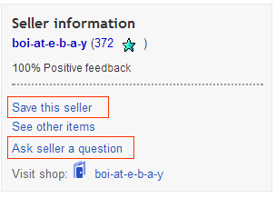
  3. Ask seller a question in Marketplaces. Is it scalable if the response is delayed by hours or days. Even users do not ask questions on top selling products.
  4. Login to Save in Wishlist. Almost everyone has feature – why. How many people come to wishlist on ecommerce sites again.
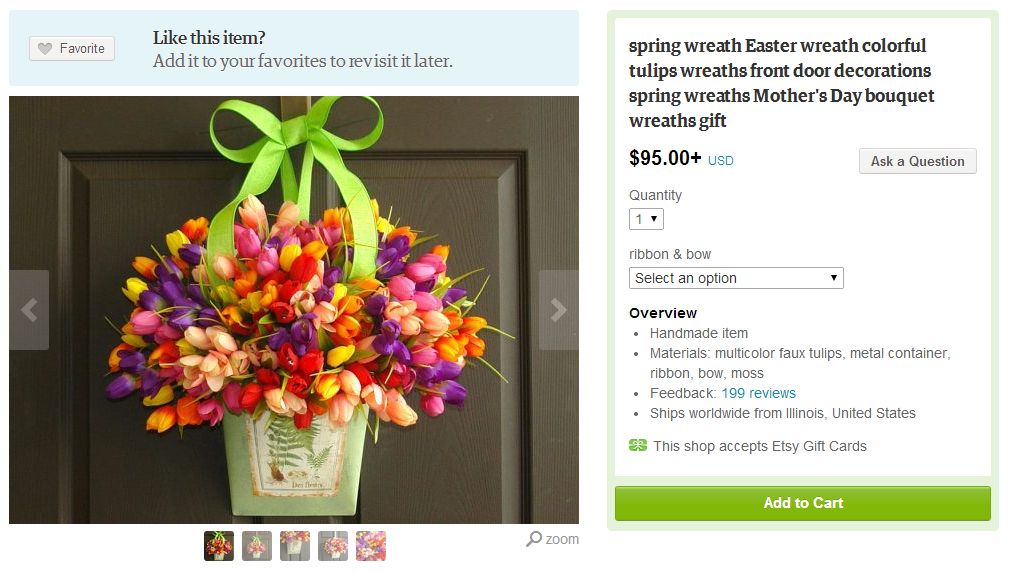
  5. Add to Favorites. This feature is great for social commerce or 100% design-only focus websites like Fab or Etsy, provided it adds value to user.
  6. SEO Fanciness – Many ecommerce services use without understanding how difficult it is for users to read.
  7. Vendor Information. Yes, we know you are marketplace, but there is a beautiful way to telling who the real seller is. (like Etsy).
  8. The filter for filters. Cool, but over period of time they all die and the data operations kill the user experience then.
  9. Comments on products. Again – engagement v/s commerce. Most services that have comments enabled, see user complaints and customer service related comments that further discourage buyers.
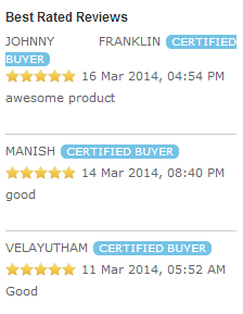
  10. Zillion Reviews that make no sense.
Fits SEO, but how helpful is this for user?

Fits SEO, but how helpful is this Product Descripion for user?

Fancy Filters

Fancy Filters – Helped me discover unknown Brands, Irrelevant Form ~ Touch is Qwerty or no. CDMA. Other OS > All known ones.

Reviews that make little sense

Reviews that make little sense

Facebook Comments - Why?

Facebook Comments – Why?

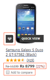
Favorite & Add to Compare

Favorite & Add to Compare

Definitely users don't want to enter in a relationship with the seller.

Definitely users don’t want to enter in a relationship with the seller.

How does this information matter?

How does this information matter?

Thanks for making this complicated. Users only care for price they will buy it for.

Thanks for making this complicated. Users only care for price they will buy it for.

There is a huge buzz around content + commerce, I believe that both of them should not mix. Content products (like Twitter, Quora, or even Wishberg for example) should focus on engagement and time-sink for its users, while Commerce products (like Amazon, Flipkart and others) should focus on transactions that are completed as quickly as possible.


f. Photos: Picture Perfect Product Pages

How important are photos on your product pages. If the answer is yes very important, make it a standard practice for product photos to be over 500 x 350 pixels. Optional images are great, zoom-in to see larger photos absolutely great – but those are optional features, the main product image makes a lot of difference.

Large Product Photos on Etsy. Also look at NastyGal's page shared above.

Large Product Photos on Etsy. Also look at NastyGal’s page shared above.

g. Recommendation that kill the Product Experience

Ecommerce sites should put a limit to the number of recommendations that are shown to the users. One of the best known Ecommerce site displays a stunning 9 set of recommendations on its product pages, that includes 35 products being recommended under pretext of ‘for you’.

Recommendations shown for a Mobile Phone

  1. More Mobile Phones from Samsung.
  2. Feature Phones from Samsung
  3. Recently Sold in Electronics & Gadgets
  4. Products Frequently purchased together
  5. More Android Mobile Phones
  6. People who viewed this item also viewed
  7. Top Selling Mobile Phones
  8. Products You Recently Viewed
  9. Recommendations based on your browsing history

Showing 35 recommendations does probably less for making up a buying decision and more for increasing dropouts or bounce rates of product pages. The ideal number of recommendations to be shown to user are 3-4 sets not more than that.

The ones that are most likely to help in conversion are:

  • Products Frequently Brought Together (provided the combined price is not greater than 3X of product price). This recommendation can be also displayed at Cart Level.
  • Customers who viewed this Product also Viewed. (Actual Recommendations)
  • Recently Viewed Products
  • Recommendations Based on Browsing History.

Flipkart & Amazon India does a great job with product recommendations.

—————————————————————————————————————–
Since I do not want this post to sound like a rant, I have attempted to re-create the first scroll product page (of the one mentioned in the first point here) by applying these best practices that I have mentioned here. This is how it looks. (Note: I am not a designer, this is recreated out of plain copy-paste tools.)

Product Page based on the best practices mentioned here.

Product Page created by me based on the best practices mentioned here. Redesigned the first image.

Concluding Notes:

Indian Ecommerce is coming out of age now, its off to a great start. While challenges like operations, logistics and customer experience are being tackled with great enthusiasm to delight users, it is time to also look at getting product management principles right and ensure users have a right user-experience.

Something I missed completely is that not a single ecommerce site reminded me of their mobile apps, isn’t mobile supposed to be the next big thing? A simple feature like ‘Send this to Mobile’ will do wonders – there is a chance that I will further share the product on WhatsApp and ask friends & family.

Remember, users that come to ecommerce websites are not here to build relationship, they are merely here to transact. Some features like Add to Wishlist, Write a Review, Rate this Product, Comment on this Product, Showing Auto-Pop to ask Email (and later spamming with newsletter), etc are not the ones really care about when they are here to transact. They are passive features, completely optional. Don’t irritate your users!

“I’m not here to enter into a relationship. I just want to buy something.” from the famous post – The $300 Million Button by Usability Expert Jared Spoon.

Ending this post with one of my favorite quotes on this topic – “Every feature has some maintenance cost, and having fewer features lets us focus on the ones we care about and make sure they work very well.” – David Karp, Tumblr.

—–

The next post in this series will be Best Practices for Shopping Cart & Checkout Process.

2014 – India Startup Landscape

Overview of India Startup Landscape – 2014

Facebook Pages: No one is talking about you!

About 3 – 4 years back, Facebook Pages was a hot property. Till just some time back, every brand, every advertiser wanted as many “Likes” as possible. At peak of this trend, some brands even did press releases on reaching 1 Million Likes.

Here is some bad news for Social Media Agencies, Consultants and every concerned with Social Media, Facebook Pages as a product has reached end of its life cycle and is no more valuable for brands. Why do I say this?

Check the metrics for some of the most popular internet brands in India and also International brands.

As defined by Facebook, the ‘People talking about this’ includes – likes, comments, shares, answering a question, responding to a event and claiming a offer. The average ‘People Talking about This’ is drastically reduced to just about 2%.

Why is this happening –

  • Facebook has two current priorities – Improve (and retain) User Engagement & Grow Revenues.
  • In a attempt to retain user engagement, Facebook wants users to engage with each other (people to people) and not with applications or pages. 
  • To grow revenues, Facebook wants you to pay to reach its audience. If the natural viral factor is high, brands no longer have to pay Facebook.
  • More pointers on this in my earlier post, where I said Facebook is no longer a powerful distribution platform.

What this implies –

  • Most pages listed above are currently (probably) not advertising on FB. It effectively means that the natural engagement of a Facebook page is now at a average of 2%. 
  • If only 2% of your page audience is going to engage, the ‘viral factor’ that introduced new users to your page will be a minuscule number. 
  • If a brand has gathered Facebook Fans / Likes by doing advertisements for its pages, value of the money spent is $0 today.
  • In case you are running any advertisements to get Likes to your page, consider halting it.
  • The only way to reach your own audience (people who have liked you) is using advertising tools like ‘Boost Post’.

So why is it a dead product? If a Facebook page (as a product) that has over a million users connected to it, but generates only 2% engagement and possibly even less viral factor is as good as dead. As a transaction product (like ecommerce) the conversions from Facebook Page will be further down since your posts reach a smaller percentage of ‘your Facebook audience’.

Going forward if the audience that you are building through Facebook Page is never going to engage with your posts, it might be a better option for advertisers to consider simply running CPC advertisements to target the necessary demographic, take users to their website and engage them there (back to pre-social media days of Facebook).

If you are a start-up building products around Facebook Pages or anything that concerns with distribution through Facebook Pages or even through Facebook, take a hard look at the data / funnels.

Some exceptions above are Mashable, BuzzFeed and 9GAG. Why? Because they are in the content business (yes Mashable too, in my opinion its no more a social media site) and for the fact that they have exceptionally high engagement numbers is probably because they are the only ones doing content marketing right on Facebook!

For everyone else, no one really is talking about you on Facebook. Not unless you are paying for it!

Graph Search: What Zuck said!

Enough articles about Graph Search. Just one thing that Mark Zuckerberg said was striking.., “Graph Search is designed to show you the answer and not links to answers.”

For the record., check the last line from the most unnoticed post on my blog – Future of Search: A Search without Links: “Future of Search is not 100s of links on the search results page. Its one result – just exactly what you want.”

#ForTheRecord

Why LinkedIn should acquire AngelList

Had predicted earlier that LinkedIn shall acquire SlideShare; Two years back I wrote that Quora should be acquired by LinkedIn, though that has not happened yet, I strongly feel its imminent to happen. Adding to that list, I strongly feel AngelList will be acquired by LinkedIn.

While LinkedIn continues to grow (it recently crossed 200 Mn users), Naval & Nivi’s efforts on AngelList have been spectacular. Over 100,000+ companies/startups listed, 2% of them are hiring (through AngelList) and over 200,000+ early adopters (which includes people who matter) on the platform. And there is speculation that AngelList is raising investments at a valuation of over $150 Mn USD.

Among few user trends I am noticing with regards to AngelList – People from startup community on Twitter are replacing LinkedIn profile links with AngelList.

Here is why I feel LinkedIn should acquire AngelList –

  • LinkedIn appeals to larger audience across multiple sectors, but startups is where the action is. For startups, AngelList is more valuable than LinkedIn.
  • Startups (or companies) are present and more active on AngelList than on LinkedIn.
  • While LinkedIn is professional resume, business connections, AngelList is business in action for Startups. Take a business vertical and be immensely valuable to them, AngelList is perfect example for this.
  • AngelList is not just beneficial to startups, but also to the entire community of startup ecosystem. Its API now handles over 3 Million requests per day.
  • AngelList is rolling out features at a much faster pace than LinkedIn… Introductions, Hiring through AL, Investing directly in startups, showcasing marquee customers for companies, service providers and so on. 
  • It will be very difficult (next to impossible) for LinkedIn to replicate such products for a particular vertical like startups. But it might be easier for AngelList to move beyond the tech startup community.
  • Technology is shaping every domain. As startups are established in multiple business verticals, it will attract talent and early adopters from every segment on to AngelList… to a point that in future AngelList might be a threat to LinkedIn.

When Quora was small, its biggest challenge was to break beyond the startup community. I don’t foresee AngelList wanting to immediately expand beyond the startup community and its focus will continue to be startups for some time.

And yes these are the early trends. With that I include a possible acquisition of AngelList by LinkedIn to my list of Tech Predictions.

Tracking My Tech Predictions: The ones that came true!

Over past few years I have been tracking technology trends, analyzing and love predicting things through posts on this blogs, on twitter or through my annual technology trends & predictions. I recently started tracking them in a attempt to see how good is hit ratio. Here are a few of those that really saw the light of day.

Other Tech Predictions mentioned on this Blog:

  • Feb 2010: Social Platform intermediaries in Social Commerce space with no clear value propositions will fail as larger eCommerce players will self-integrate.
    May 2011: Blippy / Swipely pivoted from core proposition – sharing purchases.
  • May 2011: TRPs will be questioned. Future of TRP is digital. Crowdsourced TRPs,
    Aug 2012: NDTV submits a lawsuit against Nielson alleging rigging TRP data.
    Oct 2012: Startup iDubba launches iTRPs
    Dec 2012: Nielson annouces partnership with Twitter for Twitter based ratings.
  • Sept 2011: Google+ will head no where as Social Product
    Today: Its evident! When did you last visit your Google+ profile.

From 2012 Tech Predictions:

  • April 2012: LinkedIn will acquire SlideShare
    May 2012: Yes, LinkedIn acquired SlideShare for $119 Mn
  • April 2012: Indian Ecommerce will see Acqui-hires
    May 2012: Snapdeal acquires eSportsBuy and then shuts it down.
    May 2012: Yebhi acquires StylishYou and shuts it down.
    Aug 2012: Hushbabies acquires MangoStreet and shuts it down.
    Aug 2012: FashionandYou acquires UrbanTouch, UrbanTouch management takes over.
    Related Post by me: Why Ecommerce acquisitions make no sense in early stage.
  • April 2012: Jabong will be aggressive play by Rocket Internet. Will be in Top 5 Ecommerce players in India
    May 2012: NextBigWhat apparently pointed out that they are.
  • April 2012: Series B crunch for players focused on vertical ecommerce.
    Evident: Many ecommerce startups who raised Series A struggling raising a follow on round.

From 2011 Tech Predictions: 

  • Jan 2011: VCs will consolidate Indian Ecommerce plays within own portfolio
    Feb 2012: Flipkart acquires LetsBuy
    Nov 2012: Myntra acquires SherSingh / Exclusively.in
  • Jan 2011: A large player will enter Group Buying / Coupons space
    May 2011: Times Group enters daily deals business with Times Deal
  • Jan 2011: Pubmatic will be acquired
    Nov 2011: Rumors of Pubmatic in acquisition talks by Amazon. Pubmatic turned it down for IPO
  • Jan 2011: AdMax Network
    Feb 2012: Hinted towards AdMax Network in SE Asia which leveraged local inventory and is a leader in these countries. While I expected something like this to happen in India, interestingly Komli acquired AdMax (No direct prediction here).